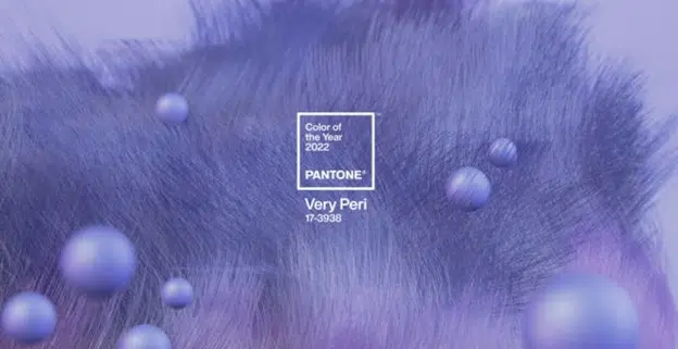
Color of the Year 2022
Let’s greet the new year with a periwinkle and a smile.
The color of the year is here! Very Peri! A fresh, energetic periwinkle to usher in, hopefully, a more optimistic year. This projected color will start to become influential and present in a lot of what you will see in design, fashion, and entertainment in the coming year.
You may ask yourself; what goes into determining the color of the year?
Let’s start with Pantone. They are the definitive source for color matching and identification and have been projecting the color of the year for 23 years now. Of course, anyone can designate a color of the year, but Pantone rules the roost.

Pantone’s process for determining the color of the year is far from an arbitrary selection. Pantone Executive Director Leatrice Eiseman told Adweek, “We have our finger on the pulse of what we call the zeitgeist.” This is a collection of awareness and observation of what is happening in our culture. Everything from art and cinema to the fashion runways. “Fashion designers are among the first to push the envelope, open up and be more experimental, so that’s an important area,” Eiseman added.
“It was really important for us to come up with a new color, because we have a very new vision of the world now,” Pantone Color Institute Executive Director Leatrice Eiseman told CNN.
It also includes a bit of speculation too and gathering a sense of the mood of the culture. So why Very Peri? What does it say about who we are right now and what we need? The color is the “happiest and warmest of all the blue hues,” blending the “faithfulness and constancy of blue with the energy and excitement of red” to deliver an “empowering mix of newness” with a “carefree confidence and a daring curiosity that animates our creative spirit,” said the company in its announcement.
According to Pantone, Very Peri “helps us to embrace this altered landscape of possibilities, opening us up to a new vision as we rewrite our lives.” It’s pretty clear we have all been rewriting our lives for the past two years, and this color brings us a sense of optimism to the “new normal.”

“It’s unusual to refer to blue as ‘happy,’ but when you add that red element to it, that’s exactly what happened,” Eiseman added, speaking to Time. “We felt it was so important to put together a color that encapsulated the feeling of newness.”
A new year is just around the corner. So, let’s greet it with a periwinkle and a smile.
Here at Chartwell, we love to do our research to help you understand your customers and goals to strengthen your marketing communications.


