Color of the Year 2023
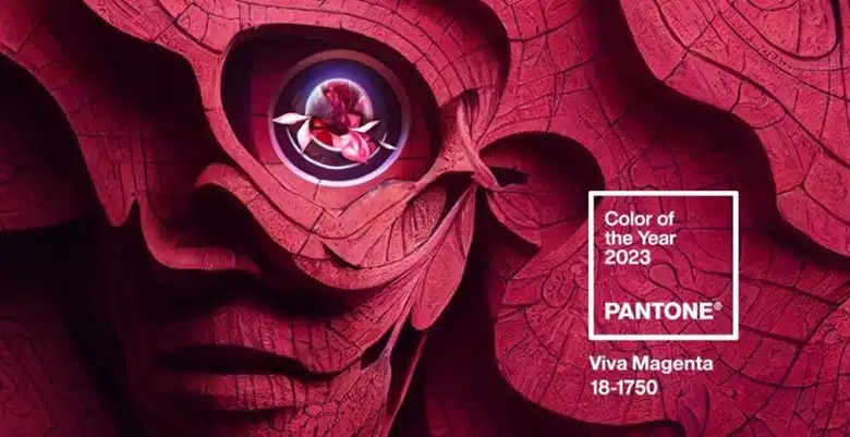
Viva Magenta
The color of the year is here! Viva Magenta! A powerful, vibrant red to give us all the vim and vigor we need in the coming year. This projected color will start to become influential and present in a lot of what you will see in design, fashion, and entertainment in the coming year.
You may ask yourself; what goes into determining the color of the year?
Let’s start with Pantone. It is the definitive source for color matching and identification and have been projecting the color of the year for 24 years. Of course, any color influencer can designate a color of the year, but Pantone’s connection to the design and fashion industries makes them the leader in such projections.

Pantone’s process for determining the color of the year is far from an arbitrary selection. Pantone executive director Leatrice Eiseman told Adweek, “We have our finger on the pulse of what we call the zeitgeist.” This is a collection of awareness and observation of what is happening in our culture. Everything from art and cinema to the fashion runways. “Fashion designers are among the first to push the envelope, open up and be more experimental, so that’s an important area,” Eiseman added.
There also is the psychological, emotional component. What does the color of the year say about who we are right now and what we need? Pantone says magenta balances boldness and fun, confidence, and humanity. It likens that to how digital spaces have accelerated our connection with others and deepened our empathy.
“In this age of technology, we look to draw inspiration from nature and what is real. Viva Magenta descends from the red family, and is inspired by the red of cochineal, one of the most precious dyes belonging to the natural dye family as well as one of the strongest and brightest the world has known.”
Leatrice Eiseman, Executive Director, Pantone Color Institute
According to Pantone: “The Color of the Year 2023 merges the richness, warmth, and strength of natural matters with the rich, open horizons of the digital world. The result is a shade of red that expands our horizons of authenticity.”

Last year’s color Very Peri was also inspired by our connection to nature and the need for that connection as we continue to face global challenges. While Very Peri was selected to emphasis peace and happiness, this year’s color is all about strength.
A new year is here. So, let’s boldy go hand in hand into the future.
Here at Chartwell, we love to do our research to help you understand your customers and goals to strengthen your marketing communications.


