Logo a-go-go
Do you have a new company or product, or is your current brand looking a little less than stellar? We have clients that come to us for a variety of design needs and often it is to develop or “fix” their brand image. Too often, a brand is developed in the eleventh hour with the least amount of attention and budget. Yet, it just happens to be the first thing we put in front of the public. Prominently displaying it on our websites, business cards, letterheads, packaging, ads, etc.
Ironically, a brand is given a lot of attention for something that most likely got very little itself, in its ideation and creation. After all, your logo is essentially the face and personality of your business. So why not give it the attention it deserves and let Chartwell guide you through our process of developing a solid brand image?
1. Design Brief/Analysis
This is the first step of the process. Here it’s all about gathering information to help understand your business and its audience. Who are you? What’s your personality? What’s your audience’s personality? All this information goes into developing an overall objective for the design process. This objective is something that continually gets referenced throughout the process to keep the design on point.
2. Research
Next, we do some homework. We take a look at the history of your company and how that legacy may play into the design process. Has your focus changed? Has your audience changed? We also look at your industry, what’s happening in it, and where you and your competitors sit in the mix. This helps us look at ways you can stand out and be a disruptor in your market.
3. Ideation, Exploration/Concept Design
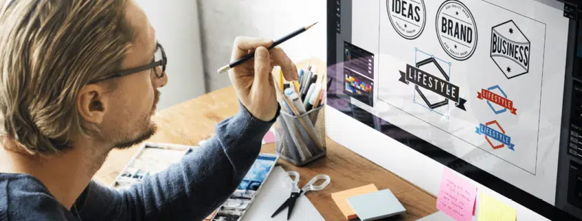
The visual process, ironically, starts with words. A brainstorming session is held to collect thoughts, ideas and impressions. Resulting in a word map. These words help drive the visual design. From this point, it’s time to put pencil to paper or pixel to screen. Here we enter a cycle of experimentation, and trial and error. Ideas will get expounded upon. One idea will evolve into another. While others get thrown in the trash. Ideas are then narrowed down to a select few that best meet our original objective and subsequently are refined for presentation.
4. Presentation
Time to get your first look at the process. Logos are always conceived, and initially presented, in black and white. It allows you to focus on the structure, balance and message of the logo without getting mired down in secondary details, like color. Examples of the logo at various sizes are show illustrate a logos scalable reproduction. Size matters, so it needs to look just as good small as it does large. It’s also the time to discuss why decisions were made based on our information gathering steps.
5. Final Logo
After the initial presentation we can go into a cycle of further narrowing and honing of ideas. Colors are explored as well as the flexibility of the logo for different applications. Until a final logo is decided upon.
Thinking your logo needs some TLC? Here are some key practices that can make a successful logo. See if your logo follows these practices. If not, Chartwell is always here to help you get your brand in line.
- It follows the K.I.S.S. (Keep It Simple Stupid) principal.
- Avoid unnecessary elements & effects
- Avoid unnecessary wordage
- Keep from being too literal
- It feels appropriate for its industry.
- It’s recognizable.
- It reproduces well in a variety of sizes.
- It’s flexible for all the applications that are required.
Remember, your brand logo needs to be much more than a graphic design if you want it to have impact for internal and external constituents.
