Debranding (Less is More)
Over the last several years there has been a trend in branding: Debranding! I’ve read and heard of several different definitions for it. It can be explained as a strategic and message retooling, or as a visual reworking, to appear more consumer-centric than corporate-centric. Both definitions have the same objective and that is to promote what a brand does for the consumer/customer rather than its industry.
What are some of the key reasons driving the trend and why you may want to consider debranding your brand?
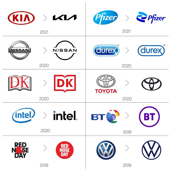
The design pendulum is always swinging. As we head too far in one direction we inevitably swing back in response. A lot of debranding is a swing back in response to previous trends brought on by the ever-new and easy technology at our design finger tips. Things that once took a great deal of time are now achievable with a few clicks. We can do so much more with much less effort. But just because we can doesn’t mean we should, and a lot of contemporary design suffers from the “we can” category. Visual debranding is the discarding of depth and detail to achieve brand clarity.
Some global brand examples:

Another key factor in the trend is the change in brand presence. Digital is the main avenue for most brand engagement. This means your brand must sit comfortably and clearly in a much smaller space. Having a brand that is overly complex and detailed just doesn’t translate well in our modern times.

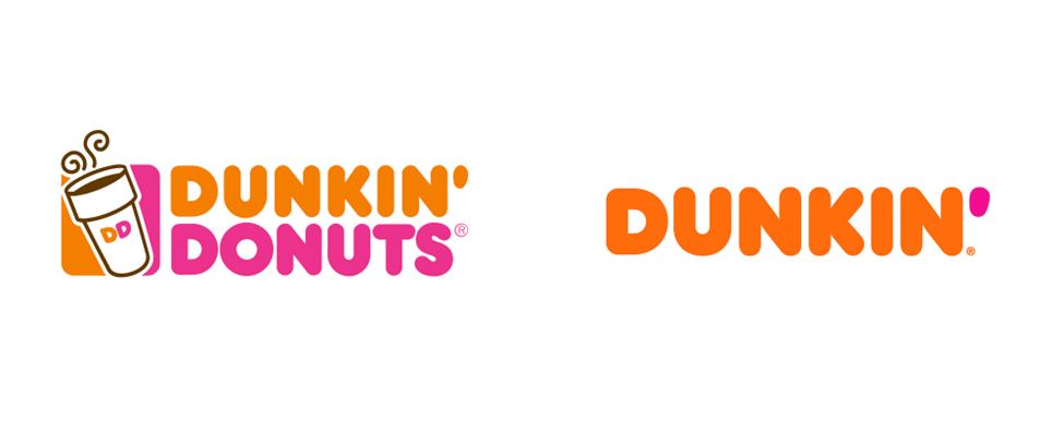
Brands also need to be flexible, and debranding can help you provide new opportunities for growth. Dunkin’ dropped its donuts as its product offerings expanded into the beverage and food market.

Do you need to debrand? At Chartwell, we define and execute the best solutions for our clients and their customers, with our years of experience and knowledge in branding and marketing across the financial, education, and healthcare industries. Connect with us today!


